Friday, 25 October 2013

proposal of cd covers

 
the  image for my other cd cover i have decided I am going to get a image of a person but shadow most of they figure out as I've seen this to be effective . i am going to use a future looking font so it will link in with the type of music.

 the cd cover I am going to do will all be done in photo shop as I will create it with out images I have taken . I plan to do a circle design what looks like it going in to the cover so it will have an dimension to it. I have seen similar designs don't like this but not how I want to do it . I plan to use bright colours to stand out like most designs have bright colours . the text will be wrapped around with the circle so it should hopefully be successfully.

Thursday, 24 October 2013

cd cover reviews

CD cover number 1:
within this cd cover their is only two main parts the image and the mast head. The text used within the cd cover is basic style what gives it a simplistic looks what is effective as it doesn't standout alone what means it doesn't clash with the image.The image used is of a toy train and a couple of fake trees this is also simple but effective as they have overlap the same image just coloured it and moved it side ways this gives it a 3d look towards the image. the image it the main thing to stand out on the page. I want use the simplistic style of text they have used within the cd cover as I believe it could be effective and will make the image stand out better over the mast head so it doesn't clash or take over most of the page. Also I like how the image has been copied and overlapped to make it stand out more and make it looks as it coming out the page.

CD cover number 2:
within this cd cover their is also only two main parts the mast head and the image this keeps it simple and makes the two part stand out and balance with each other. The text style of this cd cover stands out as it simple to read but has a sharp and sy-fi style to it ,this makes it stand out.
the image is of somebody standing of columns/podiums this makes the person stand out even though its they are small but they are in the centre of the cover.i want to try the image out in a daft to see how effective it would be with an higher contrast and blurred effect on it.

Monday, 21 October 2013

first draft


this is my first draft for cd the images are not mine but suited the style of only showing half the face this allows me to use a strong background image and have a powerful mast-head.as the cd covers i have seen some of them use the mast-head to be the most import part of it as it draws the audience towards it.
the background have been edited to help contrast it apart from the mast-head and image .i have put an inner glow and an inner shadow also to bring the images.
with the text seen to have building in it the background suits and doesn't clash with it. this is why it is effective.

the back ground for my draft copy's the style of the front as the background image is of a cracked wall this is because i believe it is effect of the type of music 'imagine dragons' makes of being an indie band.the font also has an urban style to it ,this is because is has the outline of buildings on the bottom of it.
the text has had a looks of editing to make it stand out but not to take over the cover. i wanted to give it a looks of belonging on the wall so i have tried to age it by putting a black and white cover over it and an texture to match it with the wall.i believe i have been successful in doing this

Friday, 4 October 2013


the differences between these magazine are easy to see:
such as the colours used pink for the female one and boy for the male one this is an clear difference between as we associate pink being girly and blue being boyish.
the female magazine is shown to be about gossip while the male one is about famous people who we idol such as Simon Pegg or  John Bishop
the male magazine is shown to be revealing  and the female one is about fashion and clothes.
thee styles of font used for each magazine contrast also ,the female one is bold and to get your attention while the male one looks classy and high end.
i believe both magazine are aimed at the working class because the female one would have more expensive clothing and not have an main topic of gossip while the male magazine has the main focus of famous people and the models on the cover.

Female orientated magazine


This is clearly an female orientated magazine because of theses reasons.
The colours used within the cover of the magazine are different shades of pink ,pink is associated with females. The pink stands out on the page as it used as the headings and sub headings this makes them stand out as they are female topics.
You know the magazine is well known as the main image is covering the title as well as the price stickers. Using the price sticker over shows that it is more important then the title.
the main image is inviting you in the the magazine this shows how it is friendly. It is doing this by look directly at the viewer.
The dateline is faint and only shows the month and year of the magazine this could be because its not that important to the magazine. also it is a weekly magazine so it backs up that the issue number isn't important only the gossip with in.
The main cover line is 664 summer style do in capital letters this is used to stand out and to bring the viewer in as that want to know what they are as of the large number of them.
They are cover lines (puffs) dotted around the page as they  to stand out and to bring the viewer in to find out about the gossip this makes the magazine more friendly to its viewers.
The magazine is labelled at the top of the cover Britain's number 1 women's magazine this clearly shows that the magazine is female orientated.
i believe that this magazine is based at the working class females as it main focus about gossip and getting the high end look while if it was aimed at richer people it would be different.

Wednesday, 2 October 2013

analysis male orientated magazine

male orientated magazine.
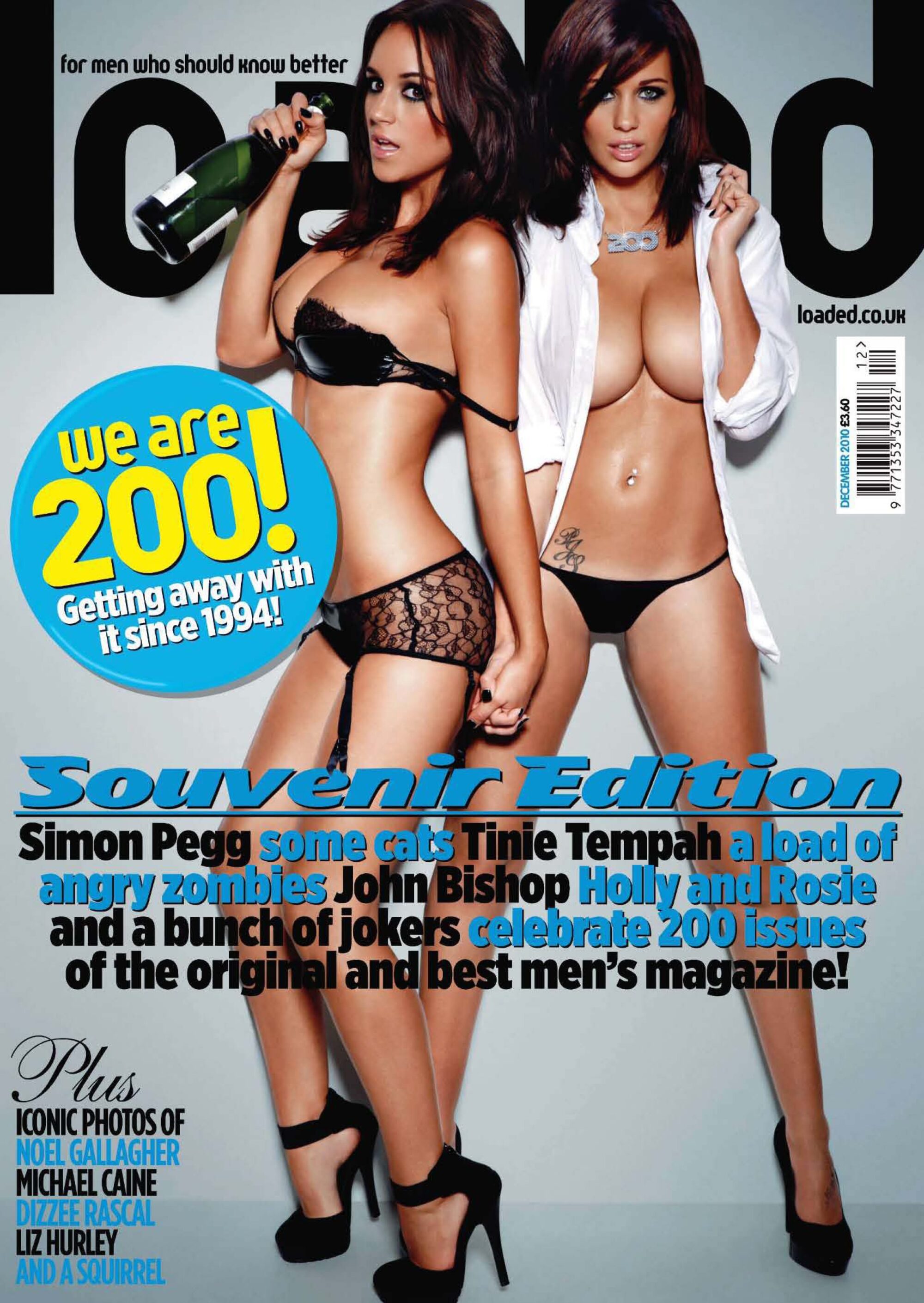
The magazine is use to entertain the male audience You can tell this is aimed at the male gender as the are to half naked female on the front cover , this will appeal to the male audience as they are good looking females in a 'sexy' stance inviting the viewer in to join them.
The main image is blocking the masthead so this shows the magazine is a well known and popular as an magazine with females within also the magazine would be seen to be respected as one.
The colours used are blues and black , blue is normally seen as a boy colour. the shade of blue used is like a high class blue so the customer would think its an high class magazine what is respected as an male magazine.
Souvenir edition would make the customer think that they need to take it back as a souvenir from going to the shop.
The to female on the cover are known as 'Holly and Rosie' they are only known by their first names so this bring a level of you have friendship with them as you know their first names.
The barcode is not at the bottom of the cover like a normal magazine so and is at the same level as their body's.
At the bottom of the page there is a small sub heading in the corner with a list of names this show that they are not as import  as the ones listed in the middle.
The two females are look directly at the viewer so this invites the viewer in to read the magazine.
The target viewer for the magazine would be males aged 18-30 . the section of the socio-economic model who would buy this magazine would be in the c's and d's  or e's so this would be middle class workers as you wouldn't expect to see a doctor or lawyer reading the magazine its more aimed at workers or students audience.
there isn't much going on in the front cover as its mostly empty apart from the main image this show how the main focus is the male image of the females.
the font used on the main subheading is seen as a prestige and luxury font style this is used to bring a bit of class to the page.


Uses And Gratification
P.I.E.S
Social Integration
Bad Education
Social integration is where a piece of media is watch or read as its an topic of a conversations between a group of workers or friends. People may not like the piece of media but will view as it because of its social integration. Bad education is normally talked about within a groups of friends so some will enjoy the program and makes references towards the program while other will only watch the program to understand the topic of the conversation.


Friday, 27 September 2013

textual analysis


Audio codes:

 For 'Peaky Blinders' would be
The main character narrating 'voice over'
The music in the background no diegetic
The diegetic noise of the factory's and the settings

Visual codes:

For the 'Peaky blinders' would be
The style of clothes they wear
How the main character stands out
The gestures and body language of each characters
This includes the facial expressions
The use of colour being dull to suit the time period its based in

Technical codes:

For the 'Peaky Blinders' would be
The camera shots used to show the characters and the settings
The shots are normally at eye level to so your there with them
The lighting is dark to suit how it would be in the time period
There is non diegetic sound used to set the atmosphere in the scenes
Is also has diegetic noise from the setting and factory's.


Friday, 20 September 2013


Uses And Gratification
P.I.E.S
Entertainment
 How I Meet Your Mother
the audience would watch an TV show for Entertainment purposes  as it might be seen as funny.how i met your mother is going in to its ninth series so it has proven that the constructed and mediation of the show works as its an successfully show .They would watch to to escape their normal lives ,they could relate to the characters like in personal identity but it is more likely to be use as entertainment.


Uses And Gratification
P.I.E.S
Personal identity
Waterloo Road
         Personal identity is where the viewer relates to the characters in a passive way within the program.
      i have chosen 'Waterloo Road' as i can relate to the characters as they are based students within a school. this is easy to relate as they are the same age and similar as I'm in college.
      i believe the cultivation theory as the show is a long running so the drama what happens within the show

Uses And Gratification
P.I.E.S
Information
Source FED
 i believe source fed is a passive as its a two step flow way of showing the the news as it is short and is only forces on a single point in the news at a time. i believe its a two step flow because you relate to the person telling you the news so you respect their opinion as being correct so you copy their opinion as your own.
when they do film reviews you respect their opinions on them and you might decide to go watch it because of this